
An HTML store theme built to convert.
Premium design, polished product pages, and a smooth shopping experience, ready to use for your next online store.
View demo


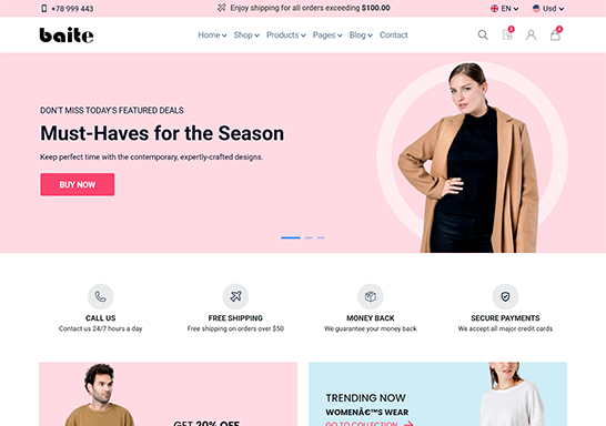

Homepages
Beautiful & unique homepage designs for every kind of online store. Freelinity gives you everything you need to build the perfect website, with multiple demos ready for any purpose.
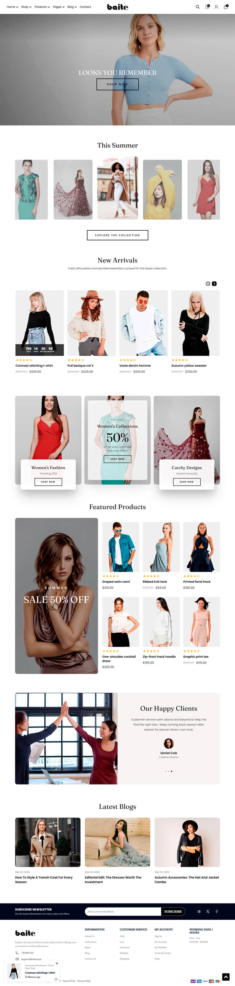

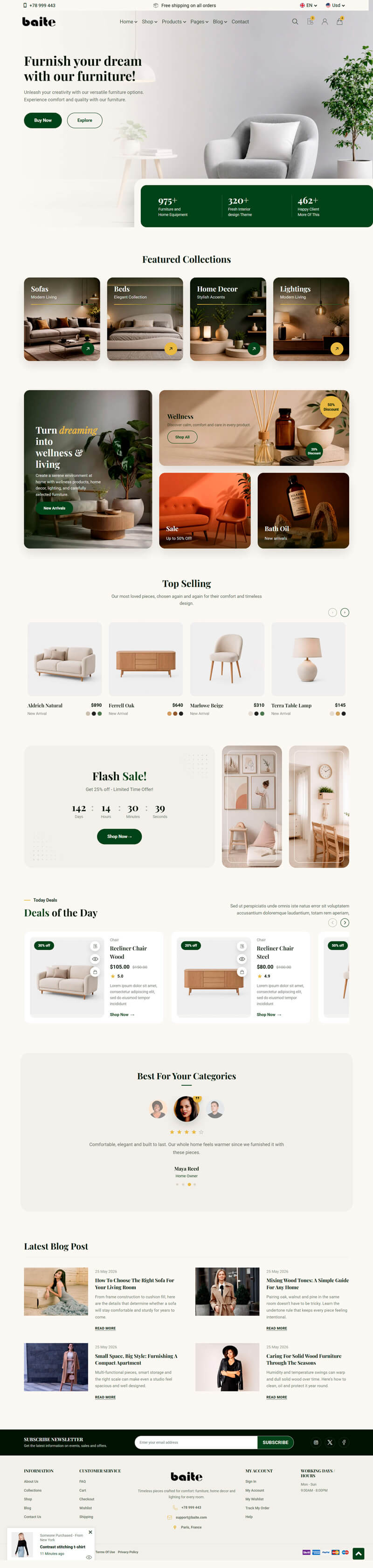
Inner Pages
Beautifully crafted inner page designs to match every homepage. Freelinity gives you everything you need to build the perfect website, with multiple demos ready for any purpose.
Features
Freelinity is built on a solid, modern foundation and packed with everything you need to launch a fast, polished online store.
HTML5
CSS3
Sass
Bootstrap

W3 validate

Responsive

Google Fonts

Browser Compatibility

SEO Optimize

Well Documentation

Fast Loading

Slick Carousel
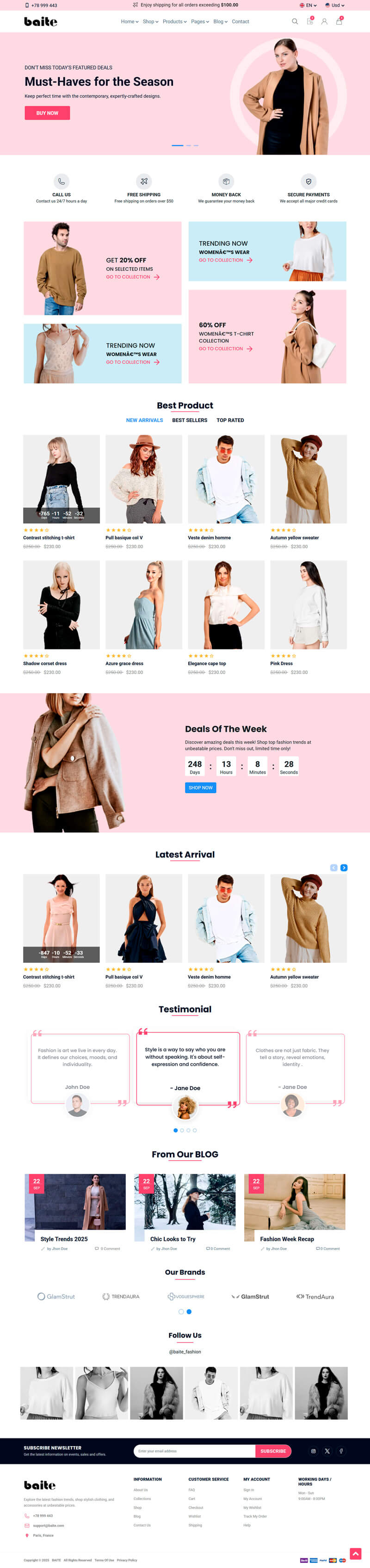
Fully Responsive & Mobile Optimized
All functions of your website are guaranteed on almost every device: desktops, laptops, tablets, iPhones, Android... giving your visitors a beautiful interface wherever they browse.
Frequently Asked Questions
Everything you need to know about Freelinity before you get started. Can't find the answer you're looking for? Reach out to our support team.
You get the full set of HTML5 & CSS3 source files, every homepage and inner page demo, the Sass stylesheets, and detailed documentation to help you get the theme up and running quickly.
Basic HTML and CSS knowledge is enough to customize text, images, and colors. The code is clean and well-commented, and the documentation walks you through every section step by step.
Yes. The theme is tested and validated across the latest versions of Chrome, Firefox, Safari, and Edge, so your store looks consistent everywhere.
Absolutely. Colors, typography, and spacing are all controlled through Sass variables, so you can restyle the entire theme to match your brand without touching the markup.
Yes, every purchase includes lifetime updates and dedicated support to help you with setup questions, bug fixes, and compatibility as browsers evolve.
Every page and component is built mobile-first and tested across desktops, laptops, tablets, and phones for a consistently polished experience.